Actived tab is hard to recognize at a glimpse
Actived tab is hard to recognize at a glimpse
Say compare to Chrome, sorry I compared to it a lot.
Re: Actived tab is hard to recognize at a glimpse
Could you please send a screenshot.
It will help determine the theme you are using (dark, themed, windows 10/11, etc...)
It will help determine the theme you are using (dark, themed, windows 10/11, etc...)
Re: Actived tab is hard to recognize at a glimpse
It's Windows 11 default theme I think, with wallpaper solid color white. It's not a test wallpaper, it being use on demand.
https://drive.google.com/file/d/1YGwyJB ... 2QftdHAtzB
https://drive.google.com/file/d/1YGwyJB ... 2QftdHAtzB
Last edited by B1-66ER on Sat Jun 08, 2024 1:32 am, edited 1 time in total.
Re: Actived tab is hard to recognize at a glimpse
Thank you for the screenshot B1-66ER,
Everything is using the stock Windows 11 light theme.
It is hard to see the selected tab.
To customize the tabcontrol colors:
Everything is using the stock Windows 11 light theme.
It is hard to see the selected tab.
To customize the tabcontrol colors:
- From the Tools menu, click Options.
- Click the Fonts and colors tab on the left.
- Change Item to: Tabs.
- Select Selected.
- Click the Background color button.
- Choose a new color and click OK.
- Click OK.
Re: Actived tab is hard to recognize at a glimpse
Oh my fault! I'm sorry. I didn't find the option of custom color. Thank you for being patient
Re: Actived tab is hard to recognize at a glimpse
Is there a way of changing the colour of the tab that is currently being used, so that the colour of the tab is changed when switching?
- Attachments
-
- tab colour.jpg (9.27 KiB) Viewed 3591 times
Re: Actived tab is hard to recognize at a glimpse
To customize the tabcontrol colors:
- From the Tools menu, click Options.
- Click the Fonts and colors tab on the left.
- Change Item to: Tabs.
- Select Selected.
- Click the Background color button.
- Choose a new color and click OK.
- Click OK.
Re: Actived tab is hard to recognize at a glimpse
Thanks David, but that changes the colour of the whole bar. What I would like (as per the screenshot), is to just change the colour of the tab that is currently in use, so that I can see at a glance which tab is currently being used.
Re: Actived tab is hard to recognize at a glimpse
Do you mean actived tab of actived window?
Actived tab = currently being use?
Or like Notepad++? You want a highlighted line, not just highlight the whole bar? That's a good idea but I guess that's not an option for now.
Please define it more specificly.
The current default highlight color is pure white, it can't be more striking without use non-white color. I tried make the inactived tab darker but that doesn't looks right with the title bar. Both Microsoft and google use non classic tab bar without title and menu bar on Chrome and the overhauled File Manager. So I guess it would takes too much effort to make one for Everything, even I hope so. Tab bar is hard to deal with visually I think, on Windows.
Last edited by B1-66ER on Sat Jun 08, 2024 9:25 am, edited 1 time in total.
Re: Actived tab is hard to recognize at a glimpse
I will consider adding an option to customize the selected tab top color.
For now, please consider setting a high contrasting selected border color:
For now, please consider setting a high contrasting selected border color:
- In Everything 1.5, from the Tools menu, click Options.
- Click the Advanced tab on the left.
- To the right of Show settings containing, search for:
tabs - Select: tabs_selected_border_color
- Click the color button.
- Select a bright color (eg: Red) and click OK.
- Click OK.
Re: Actived tab is hard to recognize at a glimpse
Just tried it..Doesn't appear to have any effect at all.
Re: Actived tab is hard to recognize at a glimpse
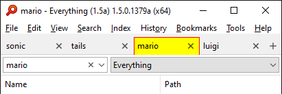
Select a custom background color too. (Tools -> Options -> Fonts and colors -> Item=Tabs -> Selected -> Background color)
Otherwise, Everything will use the stock windows tab style.

Red border with Yellow background
Otherwise, Everything will use the stock windows tab style.

Red border with Yellow background
Re: Actived tab is hard to recognize at a glimpse
I was wondering if I should mention the personal demand of hide the title bar then I gave it a try with one of my daily Autohotkey script, to change window frame style to none, and I slightly lower the normal tab bar color, then Everything looks way more better for me, just like it in fullscreen I found. It can even still use mouse to move the window, and I can live without title bar buttons, it's quite good for now.
- Attachments
-
- Screenshot 2024-06-08 180553.png (86.38 KiB) Viewed 3537 times
Re: Actived tab is hard to recognize at a glimpse
To remove the titlebar without using an AHK script:
- Go to Menu => Tools => Options => Advanced
- Type caption in the Show Settings containing field
- Select window_caption
- Set its value to false
- Go to Menu => Tools => Options => Advanced
- Type caption in the Show Settings containing field
- Select window_caption
- Set its value to false
Re: Actived tab is hard to recognize at a glimpse
Thank you NotNull, that is what I want, it's quite good with slight difference but I can handle it, do you know the frame line color around Search Edit is adjustable, It is the thing left to make the window look more comfortable for now.
Re: Actived tab is hard to recognize at a glimpse
To change the colour when hovering the search bar:
- Colors and Fonts >
- Select correct theme
- select Item = Search Edit
- Set a Custom accent color
To change the default border colour of the search bar:
- Go to Menu => Tools => Options => Advanced
- It the Show settings containing field, type or paste search_edit_border
- Select the entry matching your current theme
- Click the colour selector next to the search_edit_border_(dark_)color
- etc.
Re: Actived tab is hard to recognize at a glimpse
Those 2 are 2 corresponding colors for 2 theme right?NotNull wrote: ↑Sat Jun 08, 2024 11:59 amTo change the default border colour of the search bar:
- Go to Menu => Tools => Options => Advanced
- It the Show settings containing field, type or paste search_edit_border
- Select the entry matching your current theme
- Click the colour selector next to the search_edit_border_(dark_)color
- etc.
I can only see the dark theme border color take effect after edit search_edit_border_dark_color, if I'm using the dark theme.
But for both 2 non-dark theme, the search_edit_border_color has no effect, I also tried on instance with default configurations, same too.
I also don't understand the difference between 2 non-dark themes. Can you please explain a little bit of it?
Re: Actived tab is hard to recognize at a glimpse
Don't forget to activate the standard ("light") theme (Menu => View => Theme => Standard)
Re: Actived tab is hard to recognize at a glimpse
That happens if you did not use the Selected entry but the Normal one.
This is how it looks and works for me
Re: Actived tab is hard to recognize at a glimpse
I don't understand t6he question.
You mean User Default / Standard / Dark ?
Standard = set the theme to "light"
Dark = set the theme to "dark"
User Default = Follow the dark/light setting that is configured in Windows as the default application mode.
Re: Actived tab is hard to recognize at a glimpse
I think I did what you told, but can't get it. The screenshot is a default config instance, do you have any further thought, thank you.
Also my border is seems thinner than yours.
- Attachments
-
- Screenshot 2024-06-08 211327.png (223.76 KiB) Viewed 3478 times
Re: Actived tab is hard to recognize at a glimpse
Re: Actived tab is hard to recognize at a glimpse
For the red Search Edit thin border/frame line color in NotNull's screenshot?horst.epp wrote: ↑Sat Jun 08, 2024 1:28 pmTheme config is under Fonts and Colors, not in Advanced
Screenshot - 08.06.2024 , 15_27_13.png
Re: Actived tab is hard to recognize at a glimpse
Thanks, that's exactly what I needed.Select a custom background color too. (Tools -> Options -> Fonts and colors -> Item=Tabs -> Selected -> Background color)
Otherwise, Everything will use the stock windows tab style.
I didn't bother with the border as just having the tab coloured is ideal
Re: Actived tab is hard to recognize at a glimpse
The next alpha update will allow you to set the border without setting the background.